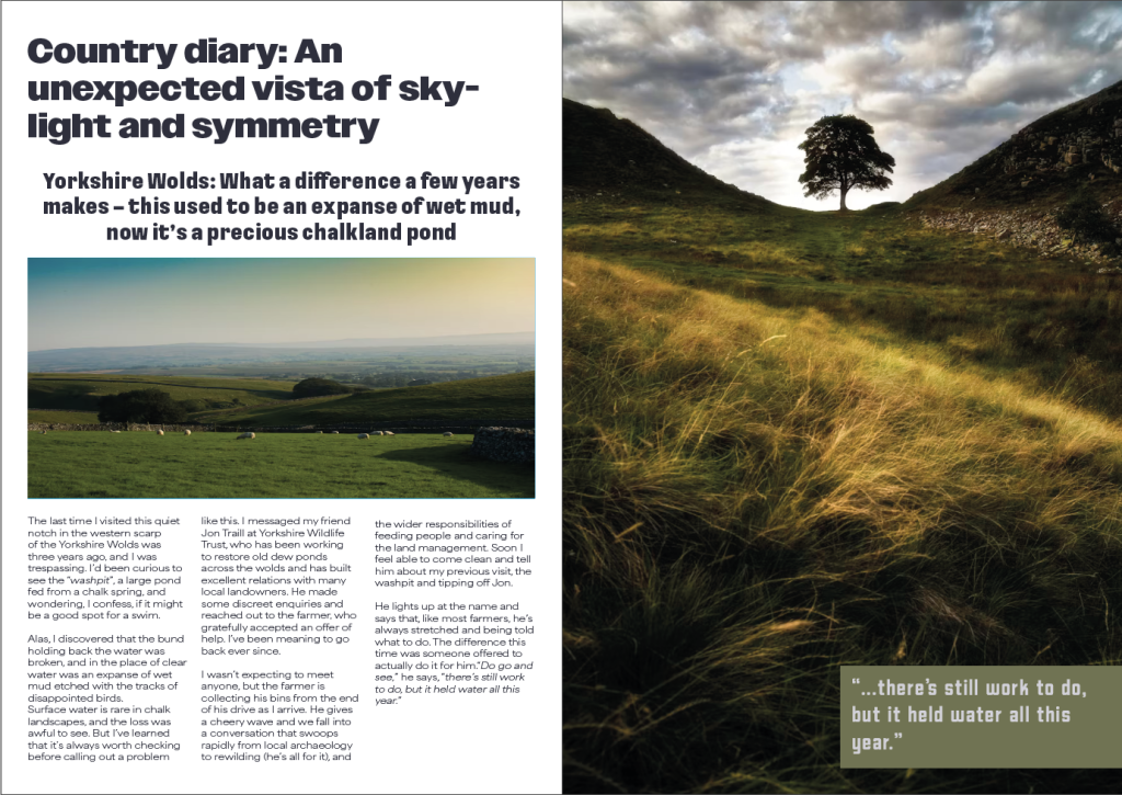
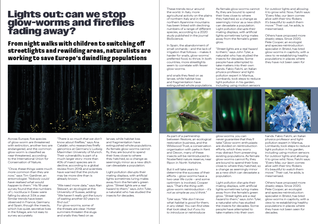
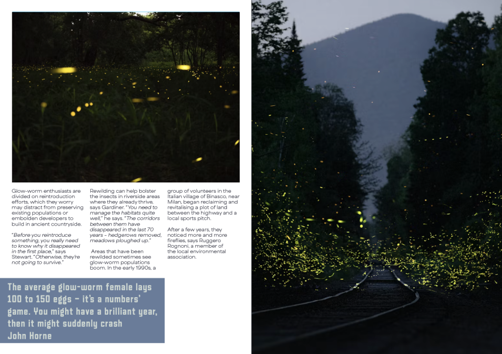
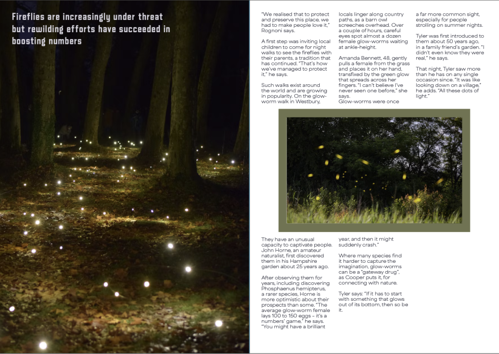
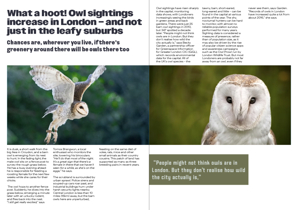
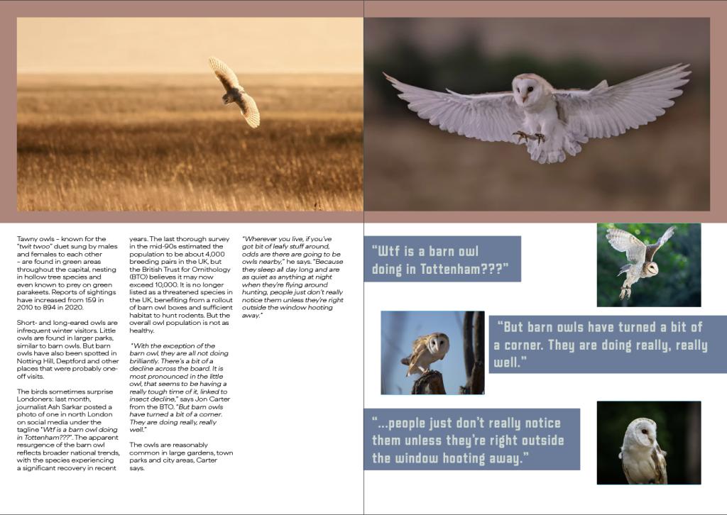
When staring my double page spreads, I first adjusted my page layout by adding three identical columns to keep all my writing and pictures aligned perfectly and to stop myself from accidently misaligning anything. I also added a margin around every double page spread so when I add my pictures I can make them come off the page to fit the margin which I think looks aesthetically pleasing while keeping a consistent space.
Once my page layout was complete, I added the first articles title and subtitle before creating three text boxes to fit each column and flowing the text in. I did this for each article to see approximately how much room would be needed for the text and while the text didn’t fill all the pages I made, I wasn’t worried about that yet as I had more to add to complete the draft layout. Once the text was flowed into the boxes, I started to add blue boxes to signify where I was going to put my images which filled al the pages I set out. When choosing how I wanted my photos laid out, I liked how it looked when I had three photos lined up with my columns of writing and how one photo covers an entire page, so I used those two layouts often. Once I was happy with the number of pictures and I adjusted the text boxes to frame everything without being overbearing.
Once I had a basic layout, I started to begin to add copyright-free photos while using the blue boxes as frames to fill and adding colours from my chosen palette behind the photos and quotes from the articles that I added into free spaces both on the photos and in free spaces below any text boxes that don’t fully reach the bottom. I then focused on fine details of the layout such as making sure the spacing between the title and subheading was the same as the spacing between the subheading and main body of text in each article and making sure all the colours fit the pictures on the same page as to not make anything look out of place. I also started to split my main body of text into paragraphs as to avoid a big wall of text that would be mostly unreadable and started to look for any speech to change the text into italics to highlight it from everything else.
Once I was happy with my spacing and colours, I started to implement my fonts starting with my titles as they would be the first thing seen and if they were hard to read it would affect the page heavily due to the title having a small description of the entire article. I then changed the typeface of my subheading to my chosen type on each article before making sure the spacing was still even on each side. I finally changed the typeface of my body text to the typeface I chose to use before double checking everything to make sure the change in typeface didn’t change any of the choices I made with my layout.
Leave a Reply