When creating a masthead, I wanted to include a sun as the magazine is called weekend and that made me think to how most people are free to enjoy the day on a weekend. Also, due to the magazine having nature content, I thought a sun would be fitting and won’t stand out from the covers I create and experiment with.
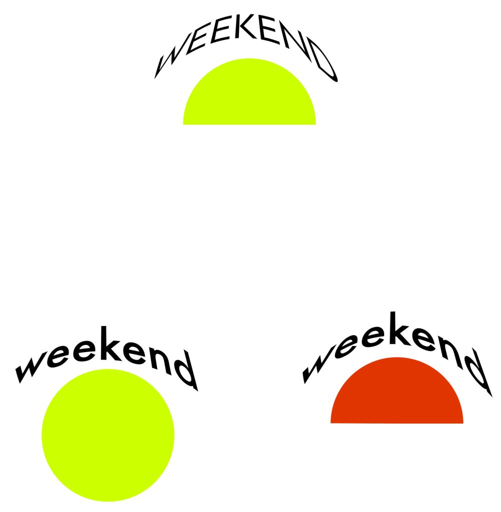
As I knew I wanted to have a sun in the masthead from the beginning, I first experimented with composition before anything else by altering the positioning of the weekend title and a circle which I used as a placeholder for the sun. At first, I used the sun to split the title in half separating the week and day sections before realising that the length would make the masthead too difficult to insert into a cover if there was limited space available for it to go into. Due to this, I experimented with more variants and eventually settled on the title warping to arch around the top of the circle which I thought was a compressed enough design which it could fit on even a limited page without looking like its lacking in any aspect as I felt like most of my experiments with composition didn’t look enough like an actual masthead and instead just looked like a title. When I settled on the composition, I decided I also wanted to cut the sun in half to mimic a sunrise which references how most magazines are delivered in the morning and to also emphasise the curve of the text by having one side flat. By cutting the circle in half, it also keeps the masthead rather compact which was my main goal as I wanted it large on the covers to be seen clearly but I didn’t yet know if I would have enough room available to do that in the way I originally planned.
Once I was happy with the composition, I experimented with colour which I wanted to get right as I removed the stroke from the sun making the fill colour bold. At first, the sun was a yellow but I though the shade was too weak, so I experimented with many other shades and tones before deciding yellow is too light of a colour to use and instead focused on experimenting with shades of reds and oranges. When experimenting, I found out that a red would be too aggressive for a nature focused magazine and instead put all my efforts into finding a strong orange shade that will stand out while still being earthy enough to fit with the naturistic aesthetic. The orange I settled on ended up being a deep burnt orange shade which I also added to the first, last and middle letter of the text to mimic sun rays and to add a splash of colour.
When choosing a typeface, I chose Area Extended with a light line weight as I planned for the masthead to be large on the covers so a bold and heavy type would be overbearing and take away from the masthead. I also added a heavy spacing to balance out the curvature of the text making it easier to read.

Leave a Reply