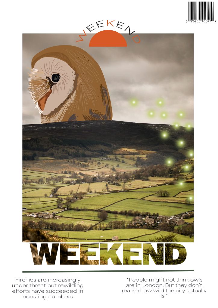
When creating my first cover, I wanted to firstly sort out my composition so I could easily include an aspect of each article without it becoming too crowded or bare. To do this, I chose a photo that would relate to one of the articles and in the first cover, that was a picture of the Yorkshire countryside which I resized to fit centrally on the page to create a border around for some inclusion of negative space. Once I had a good placement for the picture, I added a ‘Weekend’ title before thinking it looked too bland and adjusting the picture size and positioning to turn the text into a clipping mask which was to make the text look like an extension of the picture. I chose a heavy, sans serif typeface for the title to be squared off and mimic the picture instead of a lighter font which would look out of place. I also added a thin line to accent the title in a green from my colour palette which would nicely match the green of the picture and the masthead at the top to make use of some of the space on the border I created. I wanted to add some illustration to contract the picture shown so I drew an owl head and a group of fireflies before adjusting them to fit the composition of the photo and trimming them where needed. To finish off the cover, I added some quotes from the articles in a delicate typeface to contrast the title and a barcode.
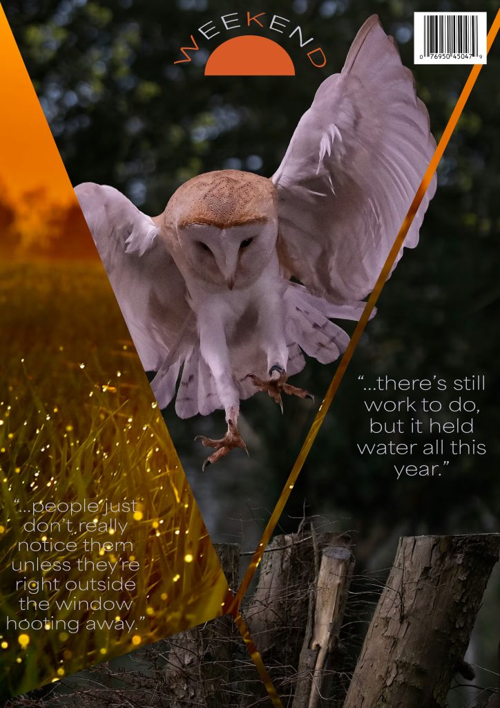
When creating my second cover, I wanted to create a mash up of two photos relating to the articles to create a shattered look which I did by choosing a photo of an owl and a landscape full of fireflies and overlaying them. I then created some triangles as they are slim enough to not take up the whole page while being thick enough to be visible and adjusting them so none of them touched to leave a thin line separating them. After having my layout, I changed one of the photos into a clipping mask to have it reflected onto the triangles while leaving the other photo as the background layer peeking through. Once I had my photos layout completed, I added my masthead at the top of the page making sure it wasn’t blocking anything and then added some quotes from the articles in the same typeface as the first cover.
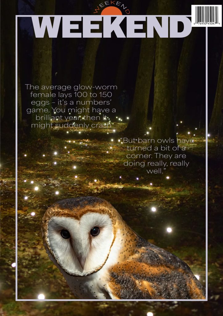
For the third cover, I filled the page with a picture containing fireflies before adding light blue border central on the photo to break it up slightly and add some contrast to the dark photo. I then added the title of ‘Weekend’ in the same light blue as the border and the same bold and heavy typeface as the first cover which when places at the top connecting with the border, adds contrast to the thinness of the line. To include aspects of the other articles, I took a picture of an owl and copied only the owl into the cover before adjusting it to fit only on the inside of the picture and cropped on the outer border which creates some depth. I then added some quotes to finish the cover off while using the same light blue as the border and title and the same typeface as the previous two covers.
Leave a Reply